Veo Vea
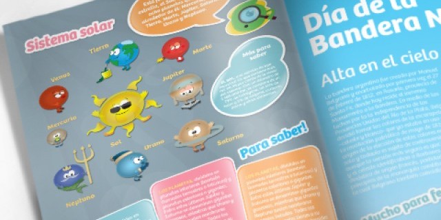
This children’s magazine published by Vea hypermarket chain has a new identity and aesthetics with lively and fun coloring.
Challenge and results.
This children’s magazine published by Vea hypermarket chain has a new identity and aesthetics with lively and fun coloring.
The project involved a new logotype that, from now on, will become the typical brand of this magazine, which is intended for school-age children. Once the isologotype was defined, the process was focused on the integral layout of the magazine, which resulted in a regulatory manual that contains several brand applications, the sub-brand development, a constructive template for the magazine cover and pages, a recommended color palette, instructions for character design, relevant graphic resources and different uses of typography.
As this product is intended for children, the idea was to generate a series of resources that would allow a lively and completely modular communication, so that all the graphic and book designers could work on the articles freely. This was done taking into account the aesthetic concept of this magazine, which is one of the most integral publications for kids, and can be found at Vea Argentina stores.
Client
Cencosud
Industry
Supermarkets
Country
Argentina